This summer I spent way too much time watching YouTube videos about decorative painting techniques. So many videos, so many ideas; eventually I had to try out some of the techniques. Foursheets of drywall, half a dozen quartz of paint, and many, many hours later, here’s what I learned:
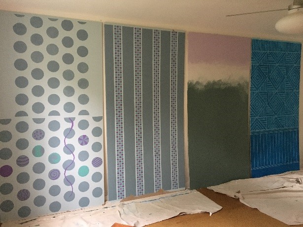
Stenciling
Most stenciling videos make it look so easy that I was sure this technique would be a breeze. I made my own Polka-Dot stencil using drafting mylar, which cuts easily with an Exacto knife, taped the stencil to a sheet of drywall that had been painted a pale gray, and used a small latex sponge to apply the darker gray paint for the dots. Removing the stencil for the ooh-ahh moment, I found more of an uh-oh moment.
First problem–the paint bled under the stencil. Not dramatically, but enough to detract. Second problem–the dots weren’t “solid,” the color underneath could be seen through in some spots.
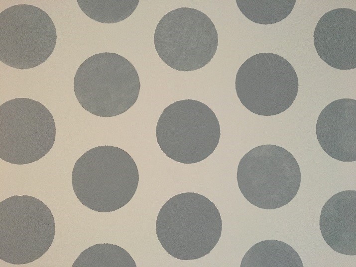
Apparently I had watched all the wrong videos. Now I know to look for advice from professionals, like Royal Design Studio Stencils and Cutting Edge Stencils. These videos have great overall information without making stenciling look too easy or too difficult. The video from Cutting Edge Studios on how to reduce bleed was an eye opener. Turns out less is more when stenciling, at least in applying the paint. And trying to create a “solid” look to the stenciled areas just goes against the nature of stenciling.
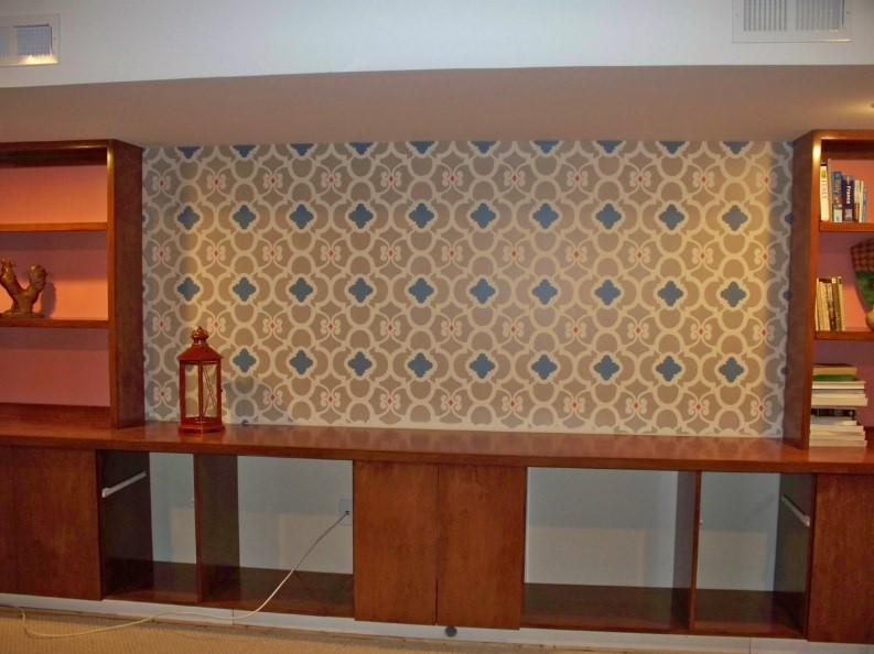
Here’s a great example of what my colleague Ellen was able to achieve with stencils:
Half way thru my stenciled dots, I gave up and tried painting with brush, after using the stencil to lightly outline the dots. Much more fun, but not quite the “perfection” that I was looking for. And once I had the paint brush out, it was hard to stop, so some dots got stripes or dots of other colors.
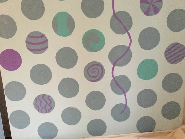
One last lesson from the polka dots: choose the color and pattern carefully. I love quiet gray-blue colors, and I love polka-dots, but I didn’t love the two together. The somber colors took some of the joy out of the dots.
Painters Tape
Painters tape is everywhere, as are videos showing you how to create fantastic effects with the tape. Again, so easy looking! I came up with a fun design–wide stripes with narrow stripes of checkerboard patterns. So simple to figure out the layout. It did take a whole lot of tape and a whole lot of time to set up–this 4×8 sheet of drywall took 1 ½ rolls of ¼” wide tape and several hours to set up.
But even before I started painting, I began worrying about paint bleeding under the tape. It was a humid day, and the ¼” wide blue painters tape didn’t seem to adhere as securely as I wanted.
When painting, I took care to tamp down the tape in each section before dabbing on the paint, but still the end results, especially at the checkerboard pattern, weren’t as sharp as I’d hoped for.
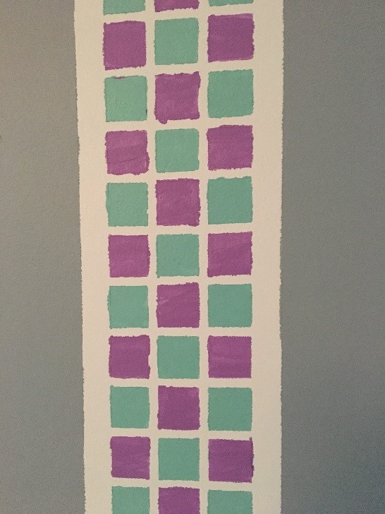
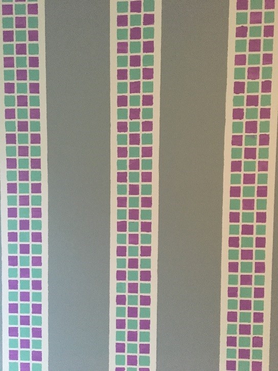
Turns out, the brand of tape matters. The green Frog Tape brand? Oh so much better at producing crisp edges. Turns out they also have a great series of videos showing you how to get the most out of their product; a must-watch series if you want to use painters tape to create a pattern. Unfortunately, they don’t make a tape as thin as ¼”.
Also, with hindsight, and a few more videos watched, I think using a stencil to create the checkerboard would have given me much better results. Next time!
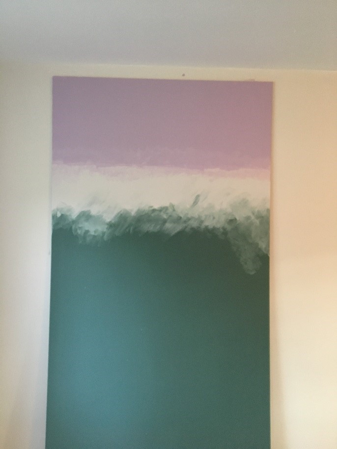
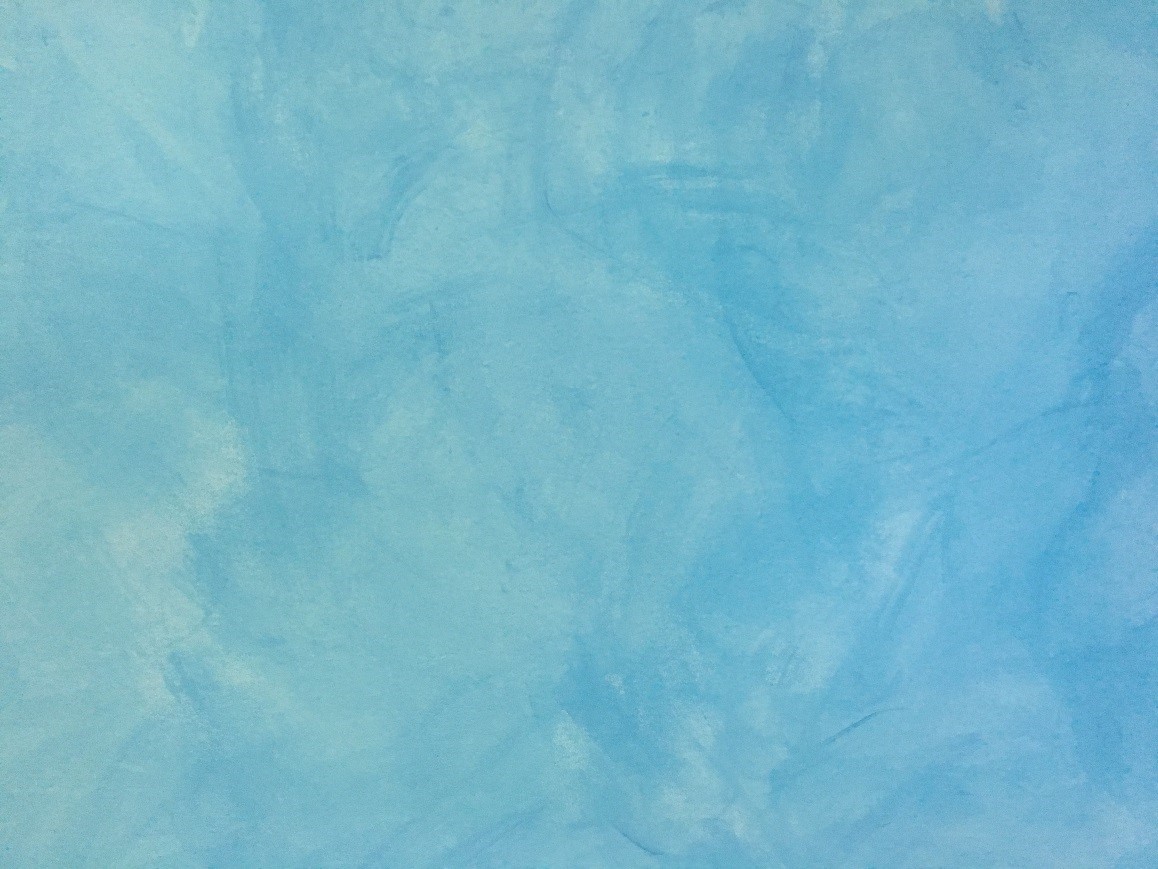
Ombre Painting, but not really
There are even more videos for this decorative paint style, and almost all of them trying to create the seamless blend from pale blue to bright blue, mimicking the sky of a sunny summer day. Nice, but not really what I was interested in. Instead, I tried using a soft green, a neutral white and a light lilac, and a looser, more painterly application style. Blending two wet paint colors sounds easy, and it is. It took a bit more patience to actually not over-blend the colors, since I want to keep a sense of the brush strokes. Having picked up a bit of knowledge in all those videos, I knew enough to blend the lighter color into the darker, and to keep a “clean” brush, with just white paint on it, so I could add more white easily.
I also quickly learned that fingers worked almost as well for adding the white paint, saving the brush more for blending. The biggest lesson learned? Do a bit of blending, then step back and take a look from across the room. Also, work in several sessions, allowing the paint to dry in between.
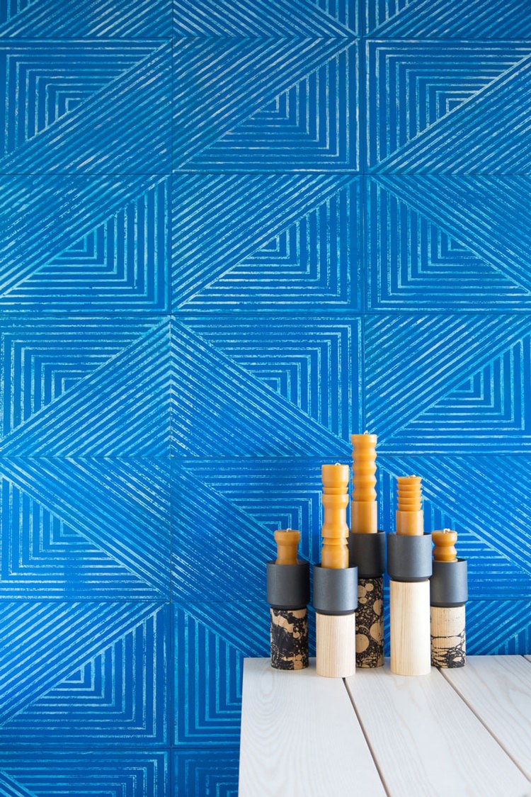
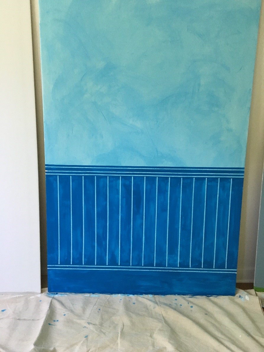
For the final test board, I wanted to try a few different techniques in combo. I had fallen hard for an image of bright blue leather wall tiles (really!) in a magazine. They had a great geometric pattern, and the vivid blue color seemed to glow.
I started by painting the entire sheet a uniform light aqua blue. Then I added a layer of bright blue, but thinned it down with an acrylic glaze. This reduced the amount of pigment I was applying, and increased the “open” time of the paint, meaning how long the paint was workable before it dried. I rubbed on the thinned blue paint, creating a stained affect over the uniform aqua paint. A nice enough outcome to consider using on its own, but also a great starter for the next steps.
I used painters tape to set up a look of beaded board wainscoting as a base for my faux leather tiles. I tried to apply the bright blue paint thickly, but not so opaque that you couldn’t see brush strokes. I still had a few “paint bleed” problems with the painters tape, but with enough happening in the base coat of paint, this didn’t bother me as much.
Next, I used ¼” painters tape above my wainscoting laying out several “tiles” at a time, none of them touching. Using the bright blue paint and a latex sponge, I applied a pretty thin coat of paint, so I could still see the light aqua glowing through the darker blue. I didn’t bother trying to make sure every tile was uniformly blue–the lighter and darker areas mimic the blue leather tiles nicely, and give a bit more liveliness to the overall affect, or so I hoped. Let dry and repeat, repeat, repeat.
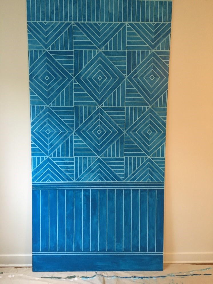
Okay, I wasn’t as careful as I should have been with some of the “tape tiles”, but altogether, I found this to be one of the most successful experiments! There is a cartoony quality overall, which makes the imperfections of the painters tape less problematic, and the not quite opaque layering of the paint gives this experiment a luminosity that I love.